Session Two
General Information
There are 18 GMT modules that directly create (or add overlays to) plots; the remaining 45 are mostly concerned with data processing. This session will focus on the task of plotting lines, symbols, and text on maps. We will build on the skills we acquired while familiarizing ourselves with the various GMT map projections as well as how to select a data domain and boundary annotations.
Program |
Purpose |
|---|---|
BASEMAPS |
|
basemap |
Create an empty basemap frame with optional scale |
coast |
Plot coastlines, filled continents, rivers, and political borders |
legend |
Create legend overlay |
POINTS AND LINES |
|
wiggle |
Draw spatial time-series along their (x,y)-tracks |
plot |
Plot symbols, polygons, and lines in 2-D |
plot3d |
Plot symbols, polygons, and lines in 3-D |
HISTOGRAMS |
|
histogram |
Plot a rectangular histogram |
rose |
Plot a polar histogram(sector/rose diagram) |
CONTOURS |
|
grdcontour |
Contouring of grids |
contour |
Direct contouring/imaging of (x,y,z) data by optimal triangulation |
SURFACES |
|
grdimage |
Project and plot grids or images |
grdvector |
Plot vector fields from grids |
grdview |
3-D perspective imaging of grids |
UTILITIES |
|
clip |
Use polygon files to initiate custom clipping paths |
image |
Plot Sun raster files |
mask |
Create clipping paths or generate overlay to mask |
colorbar |
Plot gray scale or color scale bar |
text |
Plot text strings |
Plotting lines and symbols, plot is one of the most frequently used modules in GMT. In addition to the common command line switches it has numerous specific options, and expects different file formats depending on what action has been selected. These circumstances make plot harder to master than most GMT tools. The table below shows an abbreviated list of the options:
Option |
Purpose |
|---|---|
-A |
Suppress line interpolation along great circles |
-Ccpt |
Let symbol color be determined from z-values and the cpt file |
-E[x|X][y|Y][+wcap][+ppen] |
Draw selected error bars with specified attributes |
-Gfill |
Set color for symbol or fill for polygons |
-L[options] |
Explicitly close polygons or create polygon (see plot) |
-N[c|r] |
Do Not clip symbols at map borders |
-S[symbol][size] |
Select one of several symbols |
-Wpen |
Set pen for line or symbol outline |
The symbols can either be transparent (using -W only, not -G) or solid (-G, with optional outline using -W). The -S option takes the code for the desired symbol and optional size information. If no symbol is given it is expected to be given in the last column of each record in the input file. The size is optional since individual sizes for symbols may also be provided by the input data. The main symbols available to us are shown in the table below:
Option |
Symbol |
|---|---|
-S-size |
horizontal dash; size is length of dash |
-Sasize |
star; size is radius of circumscribing circle |
-Sbsize[/base][unit] |
bar; size is bar width, set unit be u if size is in x-units |
Bar extends from base [0] to the y-value |
|
-Scsize |
circle; size is the diameter |
-Sdsize |
diamond; size is its side |
-Se |
ellipse; direction (CCW from horizontal), major, and minor axes |
are read from the input file |
|
-SE |
ellipse; azimuth (CW from vertical), major, and minor axes in kilometers |
are read from the input file |
|
-Sgsize |
octagon; size is its side |
-Shsize |
hexagon; size is its side |
-Sisize |
inverted triangle; size is its side |
-Sksymbol/size |
kustom symbol; size is its side |
-Slsize+tstring |
letter; size is fontsize. The string can be a letter or a text string |
Append +ffont to set font and +jjust for justification |
|
-Snsize |
pentagon; size is its side |
-Sp |
point; no size needed (1 pixel at current resolution is used) |
-Srsize |
rect, width and height are read from input file |
-Sssize |
square, size is its side |
-Stsize |
triangle; size is its side |
-Svparams |
vector; direction (CCW from horizontal) and length are read from input data |
Append parameters of the vector; see plot for syntax. |
|
-SVparams |
vector, except azimuth (degrees east of north) is expected instead of direction |
The angle on the map is calculated based on the chosen map projection |
|
-Sw[size] |
pie wedge; start and stop directions (CCW from horizontal) are read from |
input data |
|
-Sxsize |
cross; size is length of crossing lines |
-Sysize |
vertical dash; size is length of dash |
The symbol option in plot. Lower case symbols (a, c, d, g, h, i, n, s, t, x) will fit inside a circle of given diameter. Upper case symbols (A, C, D, G, H, I, N, S, T, X) will have area equal to that of a circle of given diameter.
Because some symbols require more input data than others, and because the size of symbols as well as their color can be determined from the input data, the format of data can be confusing. The general format for the input data is (optional items are in brackets []):
x y [ z ] [ size ] [ sigma_x ] [ sigma_y ] [ symbol ]
Thus, the only required input columns are the first two which must contain the longitude and latitude (or x and y. The remaining items apply when one (or more) of the following conditions are met:
If you want the color of each symbol to be determined individually, supply a CPT with the -C option and let the 3rd data column contain the z-values to be used with the CPT.
If you want the size of each symbol to be determined individually, append the size in a separate column.
To draw error bars, use the -E option and give one or two additional data columns with the dx and dy values; the form of -E determines if one (-Ex or -Ey) or two (-Exy) columns are needed. If upper case flags X or Y are given then we will instead draw a “box-and-whisker” symbol and the sigma_x (or sigma_y) must represent 4 columns containing the minimum, the 25 and 75% quartiles, and the maximum value. The given x (or y) coordinate is taken as the 50% quantile (median).
If you draw vectors with -Sv (or -SV) then size is actually two columns containing the direction (or azimuth) and length of each vector.
If you draw ellipses (-Se) then size is actually three columns containing the direction and the major and minor axes in plot units (with -SE we expect azimuth instead and axes lengths in km).
Before we try some examples we need to review two key switches; they specify pen attributes and symbol or polygon fill. Please consult the General Features section the GMT Technical Reference and Cookbook before experimenting with the examples below.
Examples:
We will start off using the file tut_data.txt in your directory. Using the GMT utility gmtinfo we find the extent of the data region:
gmt info @tut_data.txt
which returns
tut_data.txt: N = 7 <1/5> <1/5>
telling us that the file tut_data.txt has 7 records and gives the minimum and maximum values for the first two columns. Given our knowledge of how to set up linear projections with -R and -JX, try the following:
Plot the data as transparent circles of size 0.3 inches.
Plot the data as solid white circles instead.
Plot the data using 0.5” stars, making them red with a thick (width = 1.5p), dashed pen.
To simply plot the data as a line we choose no symbol and specify a pen thickness instead:
gmt begin GMT_tut_7
	gmt set GMT_THEME cookbook
	gmt plot @tut_data.txt -R0/6/0/6 -Jx1i -B -Wthinner
gmt end show
Your plot should look like our example 7 below
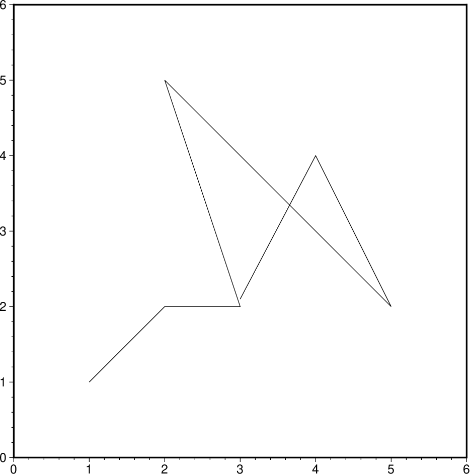
Result of GMT Tutorial example 7
Exercises:
Plot the data as a green-blue polygon instead.
Try using a predefined pattern.
A common question is : “How can I plot symbols connected by a line with plot?”. The surprising answer is that we must call plot twice. While this sounds cumbersome there is a reason for this: Basically, polygons need to be kept in memory since they may need to be clipped, hence computer memory places a limit on how large polygons we may plot. Symbols, on the other hand, can be plotted one at the time so there is no limit to how many symbols one may plot. Therefore, to connect symbols with a line we must use the overlay approach:
gmt begin GMT_tut_8
	gmt set GMT_THEME cookbook
	gmt plot @tut_data.txt -R0/6/0/6 -Jx1i -B -Wthinner
	gmt plot tut_data.txt -W -Si0.2i
gmt end show
Your plot should look like our example 8 below. The two-step procedure also makes it easy to plot the line over the symbols instead of symbols over the line, as here.
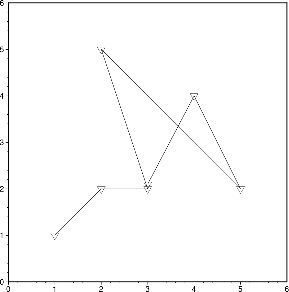
Result of GMT Tutorial example 8
Our final plot example involves a more complicated scenario in which we want to plot the epicenters of several earthquakes over the background of a coastline basemap. We want the symbols to have a size that reflects the magnitude of the earthquakes, and that their color should reflect the depth of the hypocenter. The first few lines in the remote tut_quakes.ngdc looks like this:
Historical Tsunami Earthquakes from the NCEI Database
Year  Mo  Da  Lat+N  Long+E  Dep  Mag
1987  01  04  49.77  149.29  489  4.1
1987  01  09  39.90  141.68  067  6.8
Thus the file has three header records (including the blank line), but we are only interested in columns 5, 4, 6, and 7. In addition to extract those columns we must also scale the magnitudes into symbols sizes in inches. Given their range it looks like multiplying the magnitude by 0.1 will work well for symbol sizes in cm. Reformatting this file to comply with the plot input format can be done in a number of ways, including manual editing, using MATLAB, a spreadsheet program, or UNIX tools. Here, we simply use the common column selection option -i and its scaling/offset capabilities. To skip the first 3 header records and then select the 4th, 3rd, 5th, and 6th column and scale the last column by 0.1, we would use
-i4,3,5,6s0.1 -h3
(Remember that 0 is the first column). We will follow conventional color schemes for seismicity and assign red to shallow quakes (depth 0-100 km), green to intermediate quakes (100-300 km), and blue to deep earthquakes (depth > 300 km). The quakes.cpt file establishes the relationship between depth and color:
# color palette for seismicity
#z0  color   z1 color
0    red    100 red
100  green  300 green
300  blue  1000 blue
Apart from comment lines (starting with #), each record in the CPT governs the color of a symbol whose z value falls in the range between z_0 and z_1. If the colors for the lower and upper levels differ then an intermediate color will be linearly interpolated given the z value. Here, we have chosen constant color intervals. You may wish to consult the Color palette tables section in the Cookbook. This color table was generated as part of the script (below).
We may now complete our example using the Mercator projection:
gmt begin GMT_tut_9
	gmt set GMT_THEME cookbook
	gmt makecpt -Cred,green,blue -T0,100,300,10000
	gmt coast -R130/150/35/50 -JM6i -B -Ggray
	gmt plot @tut_quakes.ngdc -Wfaint -i4,3,5,6+s0.1 -h3 -Scc -C
gmt end show
where the c appended to the -Sc option ensures that symbols sizes are interpreted to be in cm. Your plot should look like our example 9 below
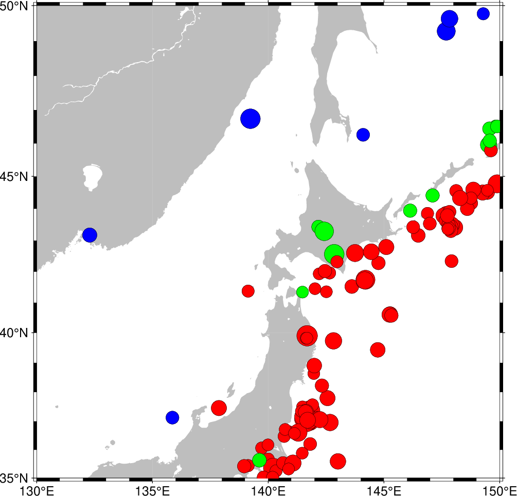
Result of GMT Tutorial example 9
More exercises
Select another symbol.
Let the deep earthquakes be cyan instead of blue.
Plotting text strings
In many situations we need to annotate plots or maps with text strings; in GMT this is done using text. Apart from the common switches, there are 9 options that are particularly useful.
Option |
Purpose |
|---|---|
-Cdx/dy |
Spacing between text and the text box (see -W) |
-Ddx/dy |
Offsets the projected location of the strings |
-Fparams |
Set font, justify, angle values or source |
-Gfill |
Fills the text bos using specified fill |
-L |
Lists the font ids and exits |
-N |
Deactivates clipping at the borders |
-Spen |
Selects outline font and sets pen attributes |
-Tform |
Select text box shape |
-Wpen |
Draw the outline of text box |
The input data to text is expected to contain the following information:
[ x y ] [ font] [ angle ] [ justify ] my text
The font is the optional font to use, the angle is the angle (measured counterclockwise) between the text’s baseline and the horizontal, justify indicates which anchor point on the text-string should correspond to the given x, y location, and my text is the text string or sentence to plot. See the Technical reference for the relevant two-character codes used for justification.
The text string can be one or several words and may include octal codes for special characters and escape-sequences used to select subscripts or symbol fonts. The escape sequences that are recognized by GMT are given below:
Code |
Effect |
|---|---|
@~ |
Turns symbol font on or off |
@+ |
Turns superscript on or off |
@- |
Turns subscript on or off |
@# |
Turns small caps on or off |
@_ |
Turns underline on or off |
@%font% |
Switches to another font; @%% resets to previous font |
@:size: |
Switches to another font size; @:: resets to previous size |
@;color; |
Switches to another font color; @;; resets to previous color |
@! |
Creates one composite character of the next two characters |
@@ |
Prints the @ sign itself |
Note that these escape sequences (as well as octal codes) can be used anywhere in GMT, including in arguments to the -B option. A chart of octal codes can be found in Appendix F in the GMT Technical Reference. For accented European characters you must set PS_CHAR_ENCODING to ISOLatin1 in your gmt.conf file.
We will demonstrate text with the following script:
gmt begin GMT_tut_10
	gmt set GMT_THEME cookbook
	gmt text -R0/7/0/5 -Jx1i -B -F+f30p,Times-Roman,DarkOrange+jBL << EOF
1  1  It's P@al, not Pal!
1  2  Try @%33%ZapfChancery@%% today
1  3  @~D@~g@-b@- = 2@~pr@~G@~D@~h.
1  4  University of Hawaii at M@!a\225noa
EOF
gmt end show
Here we have used the “here document” notation in UNIX: The << EOF will treat the following lines as the input file until it detects the word EOF. There is nothing magical about the word EOF; you can use any other string like STOP, hellobaby, or IamDone. Your plot should look like our example 10 below
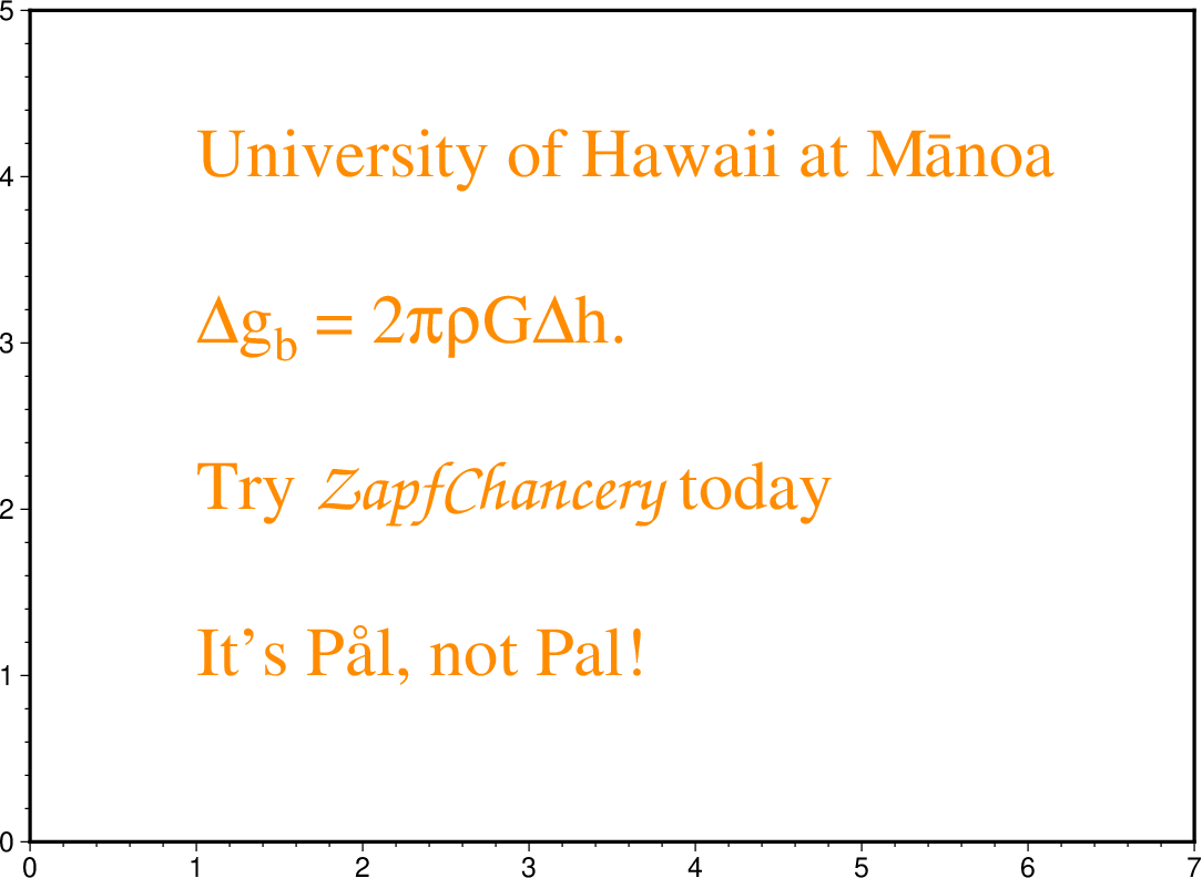
Result of GMT Tutorial example 10
Code |
Effect |
Code |
Effect |
|---|---|---|---|
@E |
Æ |
@e |
æ |
@O |
Ø |
@o |
ø |
@A |
Å |
@a |
å |
@C |
Ç |
@c |
ç |
@N |
Ñ |
@n |
ñ |
@U |
Ü |
@u |
ü |
@s |
ß |
Exercises:
At y = 5, add the sentence \(z^2 = x^2 + y^2\).
At y = 6, add the sentence “It is 32° today”.